
After years under the Oblong brand umbrella, Mezzanine is getting its own identity. The new logo represents the culmination of our efforts to consolidate the app ecosystem and streamline the user experience. It will soon be the face of the product in Mezzanine rooms, and a mark that users can more strongly associate with the name.
Ship it!
When Mezzanine hit the market back in 2012, it marked Oblong’s first foray into the product world, and the arrival of a bunch of new ideas about how people can interact with computers and with each other. We were a small and nimble team of designer-coders, focused on bringing these new ideas to fruition. We didn’t have a design team, or a sales team, or a marketing team, for that matter.
When it came time to ship the first version of Mezzanine we had a name, but we had neither a logo, nor the time or expertise to create one. To move forward, we borrowed from the established Oblong brand and set the name “Mezzanine” in the same typeface—Gravur Condensed Bold—dropped it into the app, and called it a day.
An Identity Stew
It was a sensible choice at the time. We were a young company with a brand new product. What little brand equity we did have belonged to Oblong, and dividing it seemed unwise. Fast-forward seven years, and very little about the Mezzanine identity has changed. However, both the product and the team building it continued to evolve, customer relationships evolved, and over time we’ve come to learn that the ambiguity in the brand has tangible negative effects on the user experience.
Mezzanine rooms now connect to each other so that geographically distributed teams can work as though they’re in the same room. Mobile apps allow those in the room to present with ease, and also allow those on the go to participate from afar. A new cloud service enables guests to join from anywhere via their web browser. And Screencast, a dedicated desktop application, enables wireless screen sharing to make getting pixels from a laptop to everyone in the meeting a breeze.
That’s a lot of good stuff, but it amounts to a confusing message. When people first walk into a Mezzanine room, we’re asking them to understand Oblong the brand, Mezzanine the product, and Screencast the app, on top of the various other ways to share and connect.
However if users don’t understand where Oblong ends and Mezzanine begins, or when and where to use the web app, or the mobile app, or Screencast, a fractured landscape emerges and can lead to confusion and customer dissatisfaction.
Bringing It All Together
Thanks to an abundance of recent user research efforts, it’s become clear to us that we needed a strong, focused message to unify the Mezzanine experience. We’ve been hard at work on this on the product side for some time now, bringing the best parts of the web app experience and Screencast into a single, feature-complete desktop application. Aptly named the Mezzanine app, we recognized this as an opportunity to introduce a new logo that could stand alone and carry the Mezzanine product family forward.
We embraced the opportunity, and took on the challenge as an in-house collaboration between the product and marketing design teams. We wanted a logo that reflected the geometric nature and spatial capabilities of the product, yet felt at home in the predominantly flat UI. It had to look great on a 99” 4K display, and also read clearly when reduced to 32px in a menu bar. It needed to belong next to - yet stand apart from - the Oblong logo we’d leveraged for so long. Taking these concerns together, we sketched dozens of potential directions.
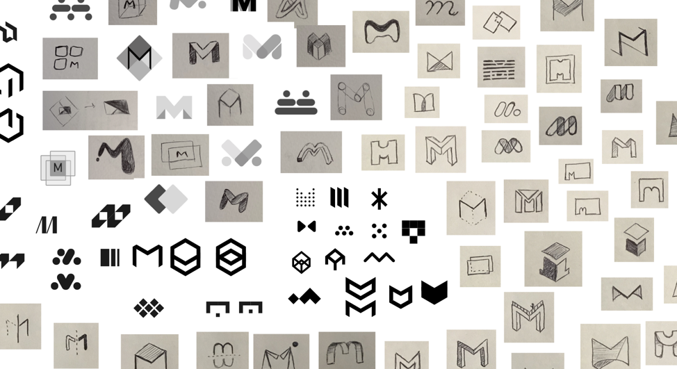
Most of them were terrible. (That’s expected when undertaking this sort of design activity!) Some worked well in one or two aspects, and fell flat in others. We used a dot voting exercise to identify the strongest options from various stakeholders in the organization, and then moved into subsequent rounds of refinement.
Only one truly stood out.
We feel that the mark is strong. It’s bold, clear, and presents an abstracted letter ‘M’ that viewers can easily associate with the product name. At the same time it’s nuanced, and can evoke a series of screens, or architectural forms, or pixels, among other interpretations as viable as they are varied.
The new logo marks the beginning of the next chapter for Mezzanine, and a concerted effort to streamline the product experience. We hope that everyone can appreciate the new logo, and even more so that it engenders a more positive experience for everyone who sets foot in a Mezzanine room.
Interested in Learning More?
Start a conversation with our team to deliver the best collaboration experience for your teaming spaces.
Contact Us